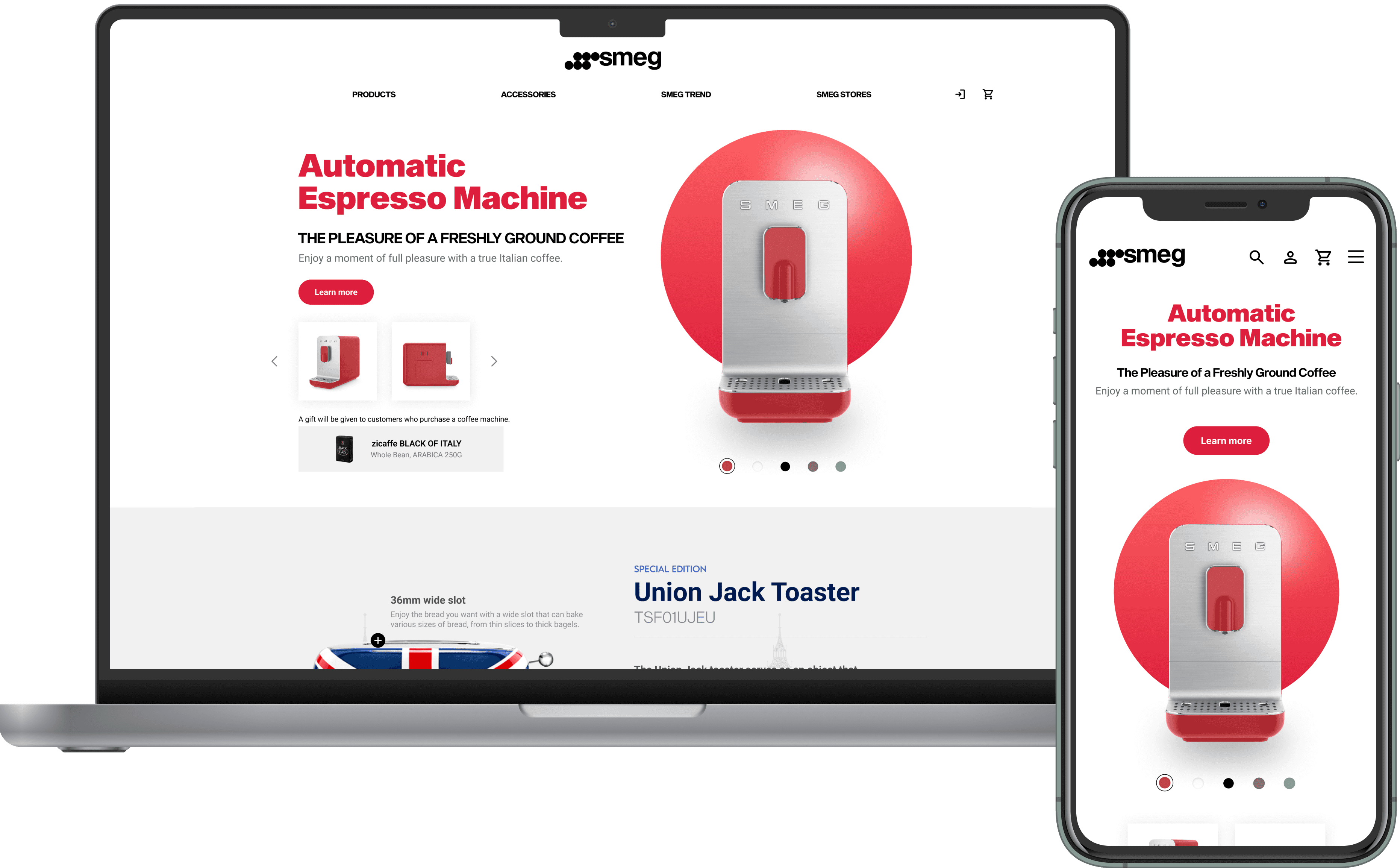
Revamping the SMEG official website
Brand
SMEG (Italian Home Appliance Brand)
Role
UX Designer
Timeline
February 2024 (1 month)
Scope
Responsive Web Redesign (Desktop + Mobile)
Overview
SMEG is a globally recognized Italian home appliance brand celebrated for its distinctive retro aesthetics. However, its digital experience lacked clarity and consistency across devices.
As a UX designer, I led a one-month redesign sprint to elevate usability, highlight collaborations, and align SMEG’s digital presence with its design-driven identity.
Pain point
Users found it difficult to discover collaboration products on SMEG’s main page.
User testing revealed that SMEG’s collaboration projects with artists and brands — one of its most unique differentiators — were buried within subpages.
The information architecture and inconsistent layout led to:
Low visibility of collaboration projects
Poor navigation between categories
Limited storytelling and product context

How might we highlight SMEG’s collaborations and
improve accessibility across devices?
Research & Insights
I conducted heuristic evaluation and competitive analysis of lifestyle appliance brands and used AI-assisted analysis tools to synthesize user pain points efficiently.


1
2
Solution
1
Information architecture
Reorganized navigation to showcase “Collaboration” directly under the homepage hero section.
Grouped related products and stories using visual hierarchy and modular grids.
Applied a consistent 12-column grid (desktop) and 8px baseline grid (mobile).
2
UX writing & content design
Refined microcopy tone with the help of language model prompts for clarity and tone consistency aligned with SMEG’s premium brand voice.
Highlighted collaboration context (“Designed by Dolce&Gabbana”, “Piet Mondrian Collection”) through micro storytelling.
3
Visual system
Adopted a minimalist color palette(Ivory Milk, Red, Blue) derived from SMEG’s physical product colors.
Applied AI-generated contrast checking tools to ensure WCAG AA compliance.
Applied whitespace to create breathing room between product blocks, improving scanability.
4
Introducing responsiveness
I converted desktop layouts into mobile by applying AI-aided responsiveness checks and eye-tracking heatmap simulations (via UX Pilot AI) to predict attention flow.
Simplified grid from 12 to single column.
Introduced larger touch targets and reduced cognitive load for scrolling experiences.

Impact
60%
Discoverability of collaboration products
40% -
Iteration time
By combining UX design thinking with AI-assisted workflows, the redesign achieved measurable improvements in both user experience and design efficiency.
Improved discoverability of collaboration products by 60% (based on prototype testing with 5 participants).
Cut iteration time by 40%, focusing more on user experience refinement rather than repetitive layout work.
Reduced visual clutter and enhanced comprehension through better hierarchy and microcopy.
Delivered scalable responsive components that can be extended across different devices.
Takeaways
Merging Craftsmanship with AI
By bridging SMEG’s industrial design heritage with modern, AI-accelerated UX practice, this project demonstrated how design thinking can elevate even a luxury appliance brand’s online storytelling.
Through this redesign, SMEG can better communicate its collaborations — transforming passive browsing into an engaging brand discovery experience.


